Responsive Layout
All JoomlaShine.com templates have special built-in design optimized for modern mobile devices iPhone, Android and Windows Mobile-based. The responsive design is for both Joomla 2.5 and 3.0 versions, and for Pro Edition only.
Unlike other template providers, we do not develop anything that looks like a mobile app with heavy menu and animation. We built a compact and lightweight version of the template that preserves the whole original look-and-feel.
Mobile layout overview on Iphone
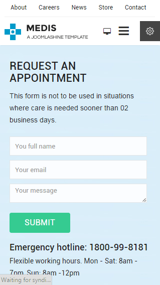
Mobile layout overview

Module positions in mobile layout
As default, all modules will be displayed on both desktop and mobile. To display a module on desktop or on mobile only, you can add the Module Class suffix parameter as follows:
- Display and module on desktop only: display-desktop
- Display and module on mobile only: display-mobile
Mobile layout overview on Ipad

Mobile layout overview on Ipad
Optimized HTML overrides for mobile
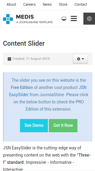
Article presentation (com_content)
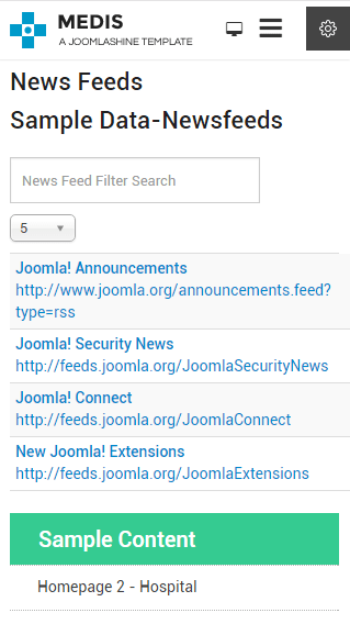
News feeds presentation (com_newsfeeds)
We have optimized HTML overrides for all Joomla! extensions to make them look neat in mobile edition. The work is mainly focused on rearrangement of content from columns to rows.
Optimized menu for mobile
For mobile edition, we have built a very simple but effective menu system where all children's menu items are presented as a tree in a collapsible panel. This menu system uses only little Javascript (MooTool) for expanding / collapsing submenu panels and is very fast and lightweight.
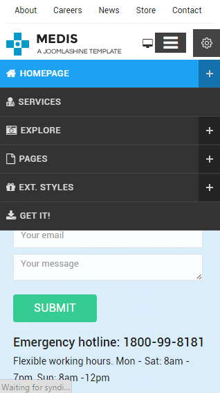
Special designed mobile menu system
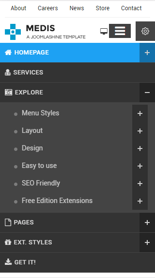
Children menu items are presented as tree
Mobile Menu with icons and rich text
The most amazing thing is the mobile menu inherits all the goodies of the regular menu like icons and rich text.
![]()
Mobile menu with icons applied
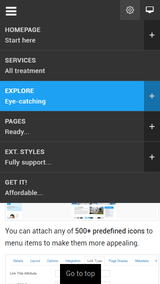
Mobile menu with rich text
The responsive feature is enabled on live demo. You can check this by resizing the demo to the desired size and see how it presents on mobile devices.
